AB’s creative director Joel O’Connor explores how bold, visual storytelling can have real impact
If you want to engage someone, tell them a story. If you want them to remember that story you need to make it visual.
The power of storytelling is well documented. Our brains are hardwired for stories – we’ve been telling them since the dawn of time, passing on information from generation to generation, from cave drawings to the printing press.
Research from the Stanford Graduate School of Business found that stories are up to 22 times more memorable than facts and figures alone. As communicators and creatives we ignore storytelling at our peril.
And while today modern storytelling can take many forms, the old adage ‘a picture can paint a thousand words’ was never truer in our image-led world. Research shows our brains process images faster than words – 60,000 times faster.
Visual storytelling is how most brands now tell their story to customers, largely thanks to the onset of visual-led social media platforms such as Instagram, Pinterest and Snapchat. And in internal comms, visual narratives are essential in connecting with hard-to-reach audiences who aren’t sat behind a desk.
So, what makes great visual storytelling? We’ve put together some examples that are creative, bold and, most importantly, impactful.
Let the visuals do the talking: the power of a poster
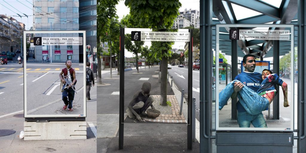
This is Amnesty International’s ‘It’s not happening here’ campaign. Each poster was tailored to the environment it was displayed in, creating the illusion of two worlds colliding. This hyper-local campaign really brings home the point. It’s not happening here – but it’s happening NOW, and in a place just like this.
Play on emotions
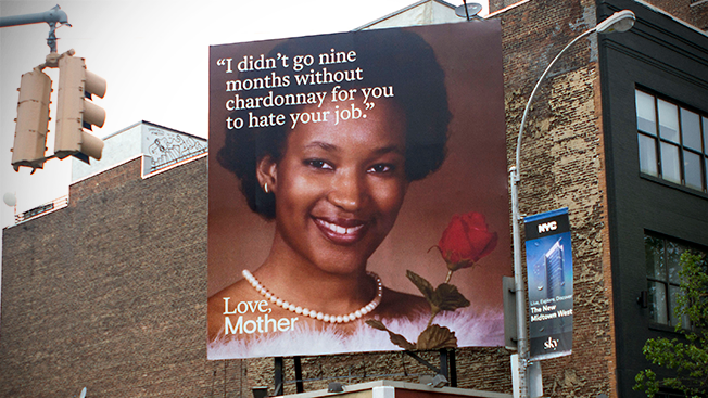
The ad agency Mother pressed a different kind of emotional button with its humorous, self-promotional campaign in the lead up to Mother’s Day in 2017. It surveyed 150 mums from Mother to collect material for the campaign, designed to honour all mums out there. It then displayed ‘words of wisdom’ style posters all over New York. It also used this campaign to thank its employees and gave them the following Monday after Mother’s Day off… how’s that for engagement.
Make it tangible: creating impact through installation
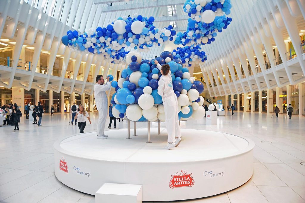
Water Clouds by Stella Artois was displayed in Westfield World Trade Center. The installation shows the impact that its global water campaign has had across the world – each bubble represents someone in the developing world that now receives clean drinking water as a result of their work. The display was made wholly inclusive – with people being able to add to the installation – and snap pics for social media.
Make it identifiable
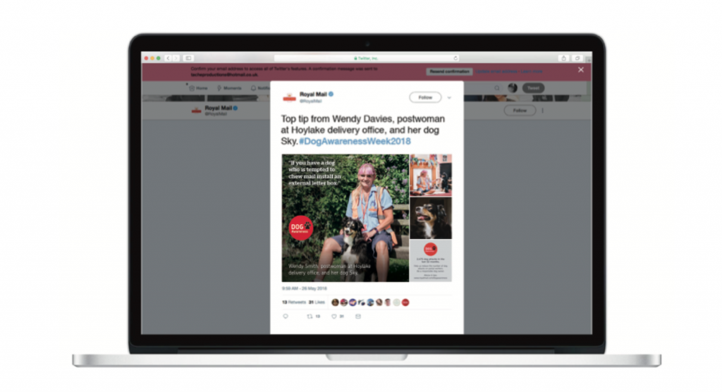
In visual storytelling it’s important to make it relevant or easy for your audience to identify with. That’s the approach we took for the Dangerous Dogs campaign for our clients Royal Mail. We used dog-loving posties to deliver safety messages to the customers and frontline employees. Taking the perspective of a loving dog owner proved incredibly successful. Not only did it deal with any sensitivities we’d encountered in previous years, it blurred the line between internal and external communications. This storytelling was picked up by the national press.

Put people at the heart
More often than not, when organisations go through a rebrand, the IC team is just given a fresh set of assets and some guidelines to follow. But in this refreshing approach, Survey Monkey brought employees along for the ride.
The whole point of the Survey Monkey rebrand was to encourage and ignite curiosity internally – and transform the company from a fun-loving ‘monkey business’ survey tool into a people-powered data platform.
In their own words
Airbnb empowers its hosting community to create their own branded content. They can even create a personalised version of the logo that represents them and the experience their guests will receive. This is a brave example of creating something and letting it live, breath and evolve. And of letting people tell their own stories.
Make it memorable
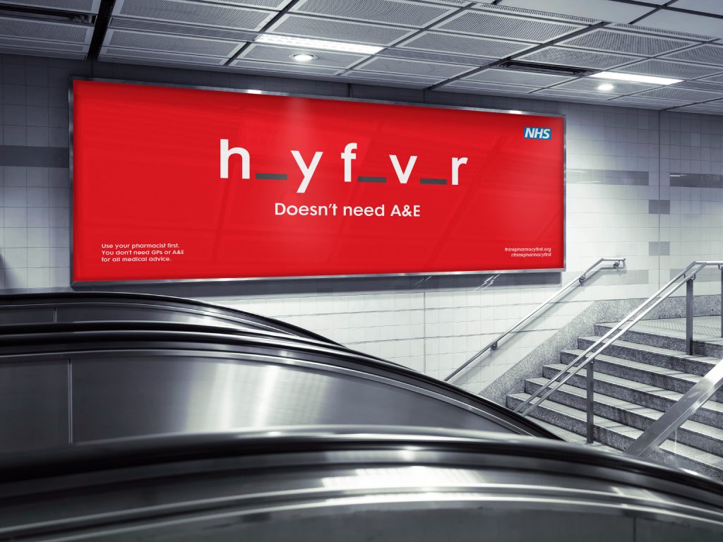
We all loved this one at AB when it came out. This was commissioned by Manchester City Council and has that clever ‘ah’, penny dropped moment to it. It’s simple but brilliant. And, more importantly, its memorable.
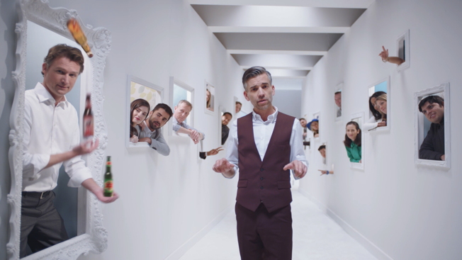
Have you seen Heineken’s ‘Go Places’? It’s a very impressive interactive job interview tool that tries to match personality to role. Once you’ve gone through the interview it matches you with vacancies on LinkedIn. The idea is to give a sense of the culture and see if it’s the right fit for the candidate
Use visual humour
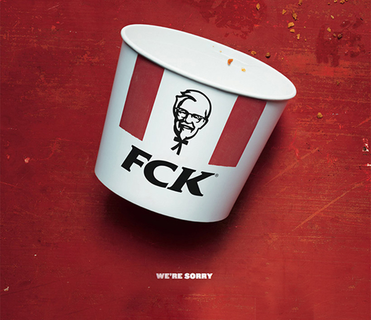
And you know if you take a chance and it all goes wrong, you can learn a lesson from our finger-licking good friends at KFC. This was their response on social media for that embarrassing time when they ran out of chicken.
Like what you see? Find out more about our creative work here or follow us on twitter @abthinks and Instagram @Ab.creates

